
Cartonfolk Request a Quote
Home / Packaging guides / Design studies

Packaging design studies

These are fictional order briefs for a skincare set and a coffee subscription. The diagrams show what a buyer could ask to try on a physical sample.

Skincare gift set ↓Coffee subscription mailer ↓

Illustrative brief · Beauty & fragrance

Getting a grip on a cream jar

In this example, a skincare brand is planning 500 welcome sets, each with a 30 ml dropper and a 50 ml cream jar. Both labels face you when you open the lid. The awkward part comes a moment later, when you reach for the jar.
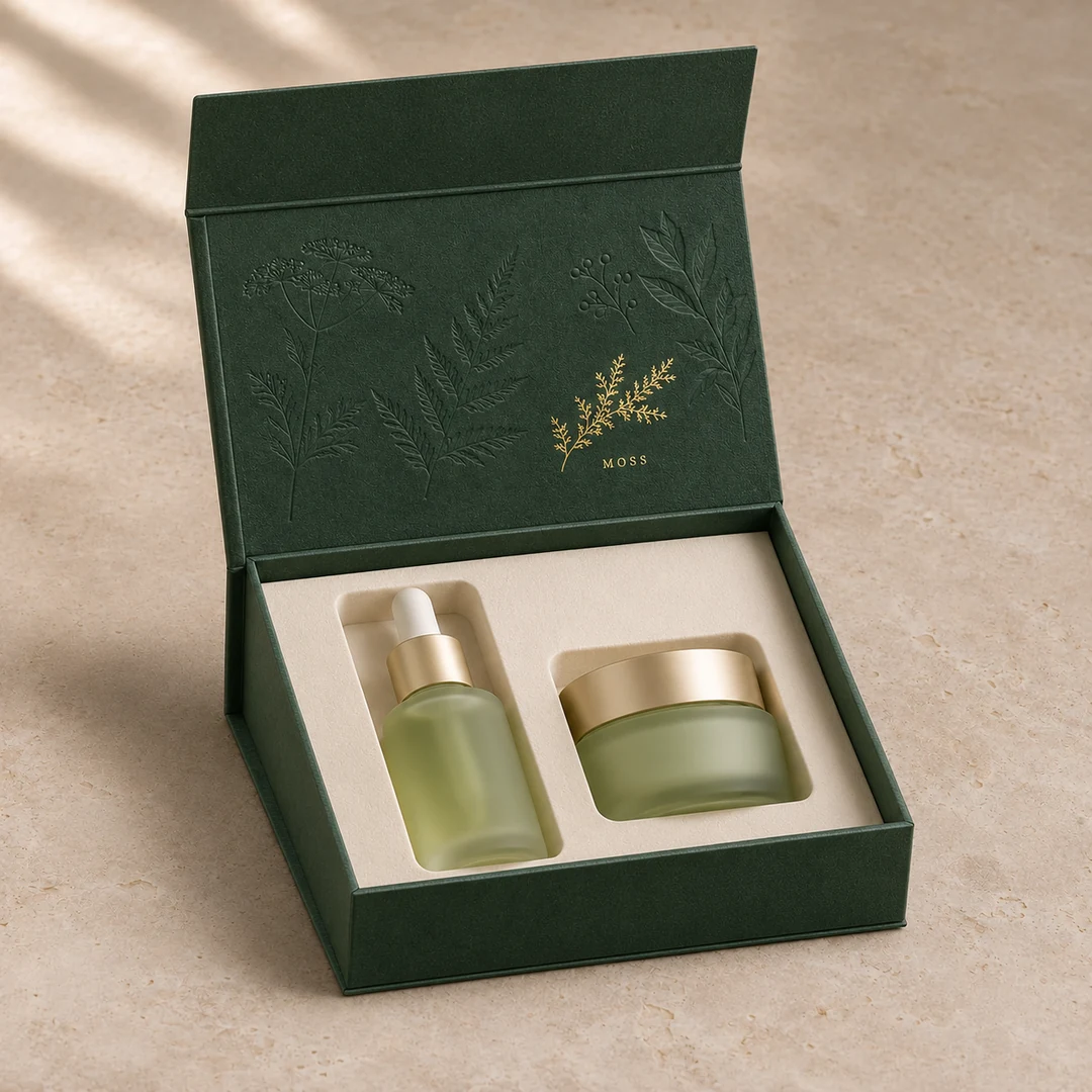
Open green book-style box with a glass dropper bottle on the left and a shorter cream jar on the right. The closing flap is above the upright lid.
Magnetic rigid box
  1. Dropper clearance

    Measure the capped bottle at its widest shoulder. Seat a filled sample and close the lid gently. If it presses on the dropper, adjust the pocket depth before changing the overall box height.

  2. Room to lift the jar

    A pocket deep enough to align both labels can bury the shorter jar. Try lifting it by the body. If fingers only reach the cap, add a finger recess or raise the pocket floor.

  3. Magnetic flap alignment

    With both products in place, fold the lid over and let the flap meet the front wall. Check that it sits flat without pulling the lid forward or squeezing the insert.

Give the jar two finger recesses

First layout · a close-fitting round pocket
Proposed revision · room for a thumb and finger

A deep, round pocket leaves only the cap to grip. The next drawing keeps the bottle pocket as it is and cuts two finger recesses beside the jar. Before signing off, pack both filled containers, lift the jar out with one hand, then close the lid. If the lid touches the dropper, the insert still needs work.
Illustrative brief · Food & drink

Where the tasting card goes

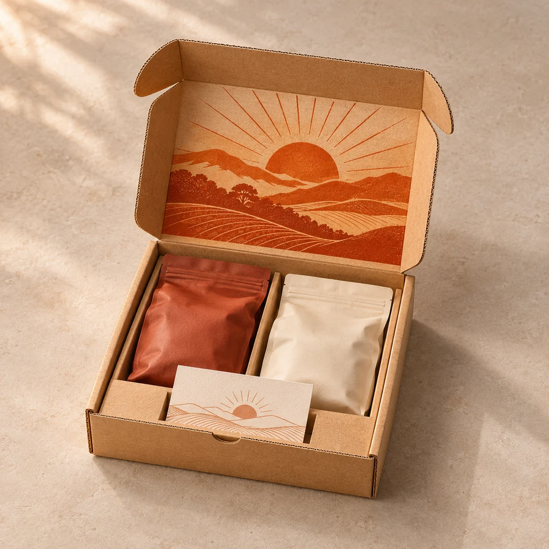
Imagine packing 1,000 subscription mailers with two 250 g bags of coffee. One bag sits a little higher because of the way the top seal folds. A tasting card laid across the bags looks fine on the packing bench. Stand the box on its edge and the card has somewhere to slide.

Open kraft mailer with an orange landscape inside its lid, two pouches divided down the centre, and a tasting card at the front.
Printed corrugated mailer
  1. Artwork across the lid

    Fold a printed proof along the actual scores. Look at it from the opening angle and keep the main illustration clear of side flaps and crease lines.

  2. A divider for filled bags

    Compare the pockets with the pouches after filling and sealing. Check the gussets and valves for pressure, then trial the closed pack on the intended shipping route.

  3. Card position on arrival

    Pack the card at the front, close the mailer and turn it through each orientation. If it slides over the artwork or into a side gap, test a retaining slit in the insert.

Give the card a place at the front

First layout · loose card resting on the pouches
Proposed revision · two cuts hold the lower corners

Keep the card at the front and try two retaining cuts in the insert. The packer can tuck in the corners after loading the pouches. For a sample review, pack the fullest bags, close the lid and turn the mailer over. Check the card, the seals and the divider again after a trial shipment.