
Proofing foil, embossing and printed kraft
Compare printed kraft, blind embossing and foil stamping using three visual examples. See which paper and artwork details to check on a physical sample.
Compare surface finish swatches ↗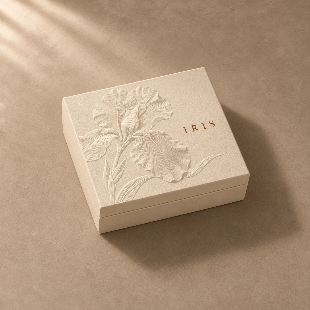
Blind embossing
A raised iris catches side light on ivory paper. The paper itself supplies the colour.
Ask to see the motif pressed into the intended cover paper. Examine the shallow lines in side light and check that narrow gaps between petals stay open. Keep the raised area away from the wrapped edge.
Perfume bottle gift box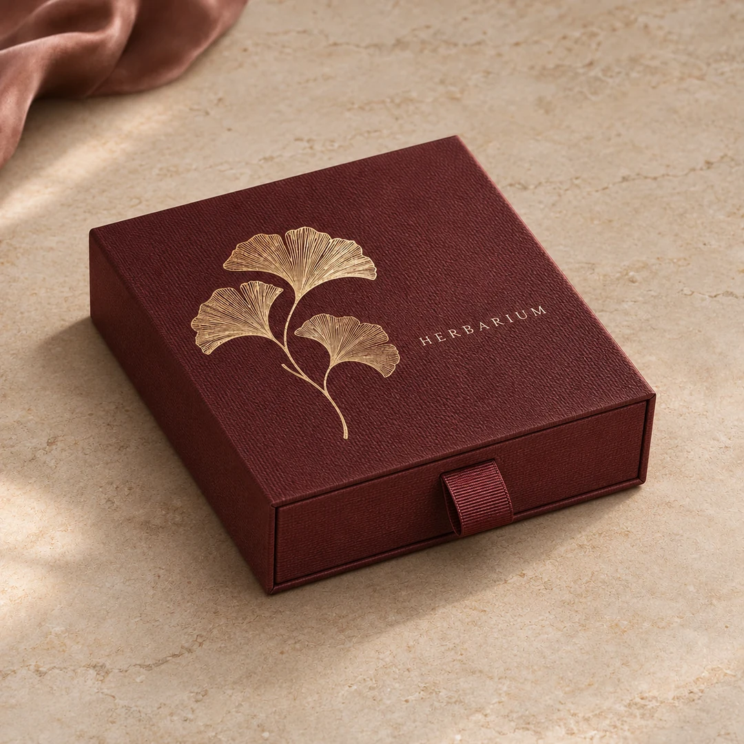
Foil stamping
Fine gold lines reflect light against the grain of a burgundy paper wrap.
Use a separate vector layer for the foil artwork. Check small lettering on the actual paper: a rough grain can break a fine line. Compare the foil swatch in daylight and under the lighting used at retail.
Jewelry drawer box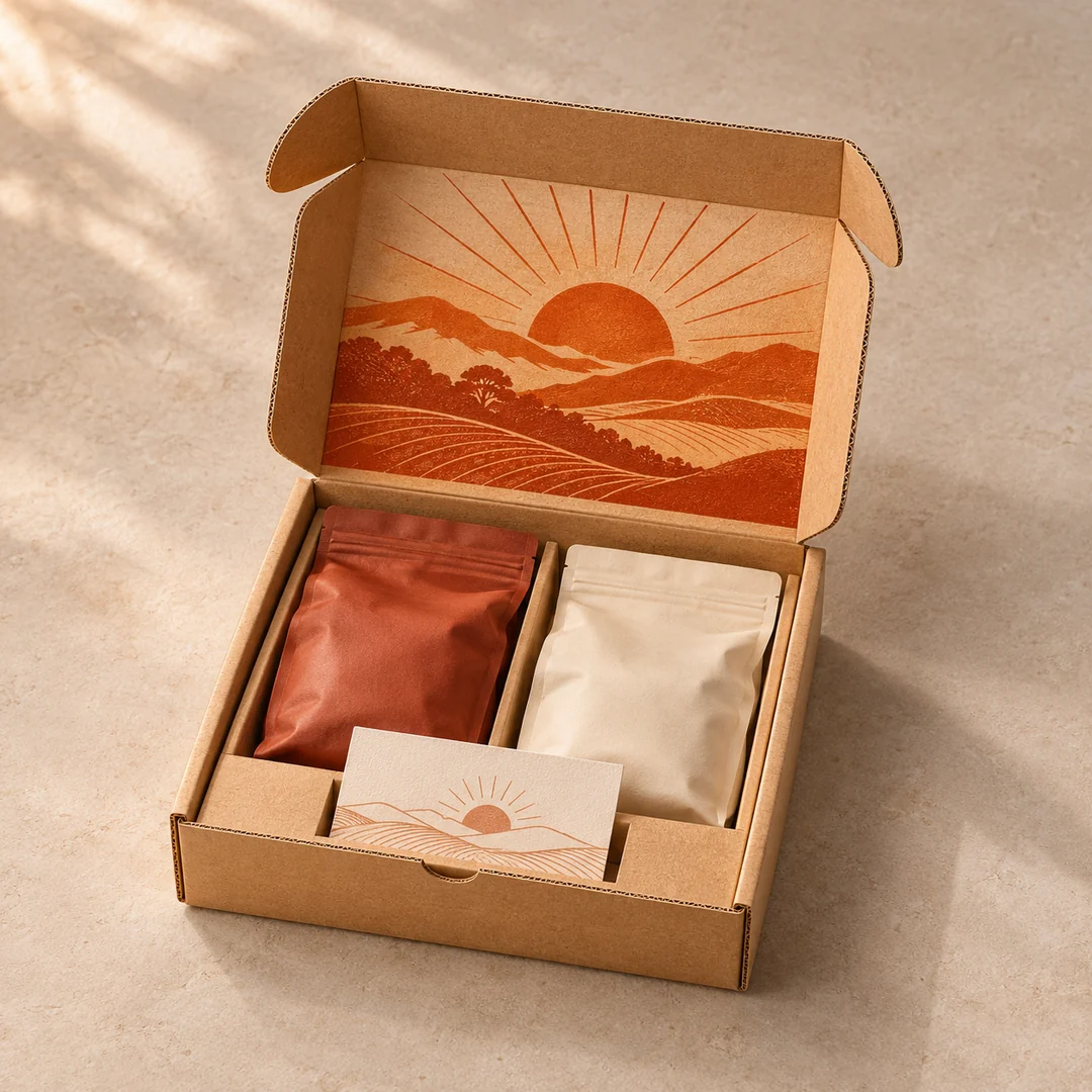
Printed interiors
A sunrise printed inside the lid makes the first reveal part of the artwork.
The brown board shows through the unprinted areas. Approve the ink on the intended liner, then fold the sample to check that artwork clears scores, locks and the insert.
Coffee subscription mailerReview colour, texture and reflectivity on a physical sample.